
Matri x NHL:
Revolutionizing Decision Making with Data in 3D
Command and Control, Reimagined
I led end-to-end design and product strategy for innovative 3D data visualizations, leveraging multimodal design techniques and neuroscience principles to propel meaningful, data-driven business impact.


The Product:
Immersive Data Visualizations
Matri’s 3D data visualizations integrate advanced spatial, visual, and interaction design with the neuroscience of visual perception, transforming complex datasets into intuitive systems that deliver actionable insights. This product significantly improved outcomes for a government agency, a professional sports team, and a financial institution, showcasing its adaptability across high-stakes environments.

Key Stats:
12% decrease in time on task
30% increase in data-driven decisions
50% boost in user satisfaction
60% increase in scouting data usage, overcoming initial resistance
Key business goal achieved
The Problem:
Making complex data actionable
When an NHL team struggled to utilize player data due to system complexity and internal resistance to change, my team and I set out to develop a solution that would transform how data was organized and understood. Our goal was to visually and spatially arrange data to foster quick, enjoyable insight gathering among diverse stakeholders. This supported the key business goal of reaching the NHL playoffs in 3 years.
Measuring Success:
“Are we there yet?”
To ensure success, Matri's visualization product needed to:
Simplify workflows, as measured by reduced time on task and improved user satisfaction
Bridge communication gaps between technical and non-technical stakeholders, addressing a major pain point in the player acquisition process
Empower decision-makers with actionable insights, as measured by before-and-after field studies of player acquisition meetings.
Shaping the Solution:
Process Insights
Ideation and Rapid Iteration:
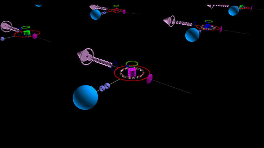
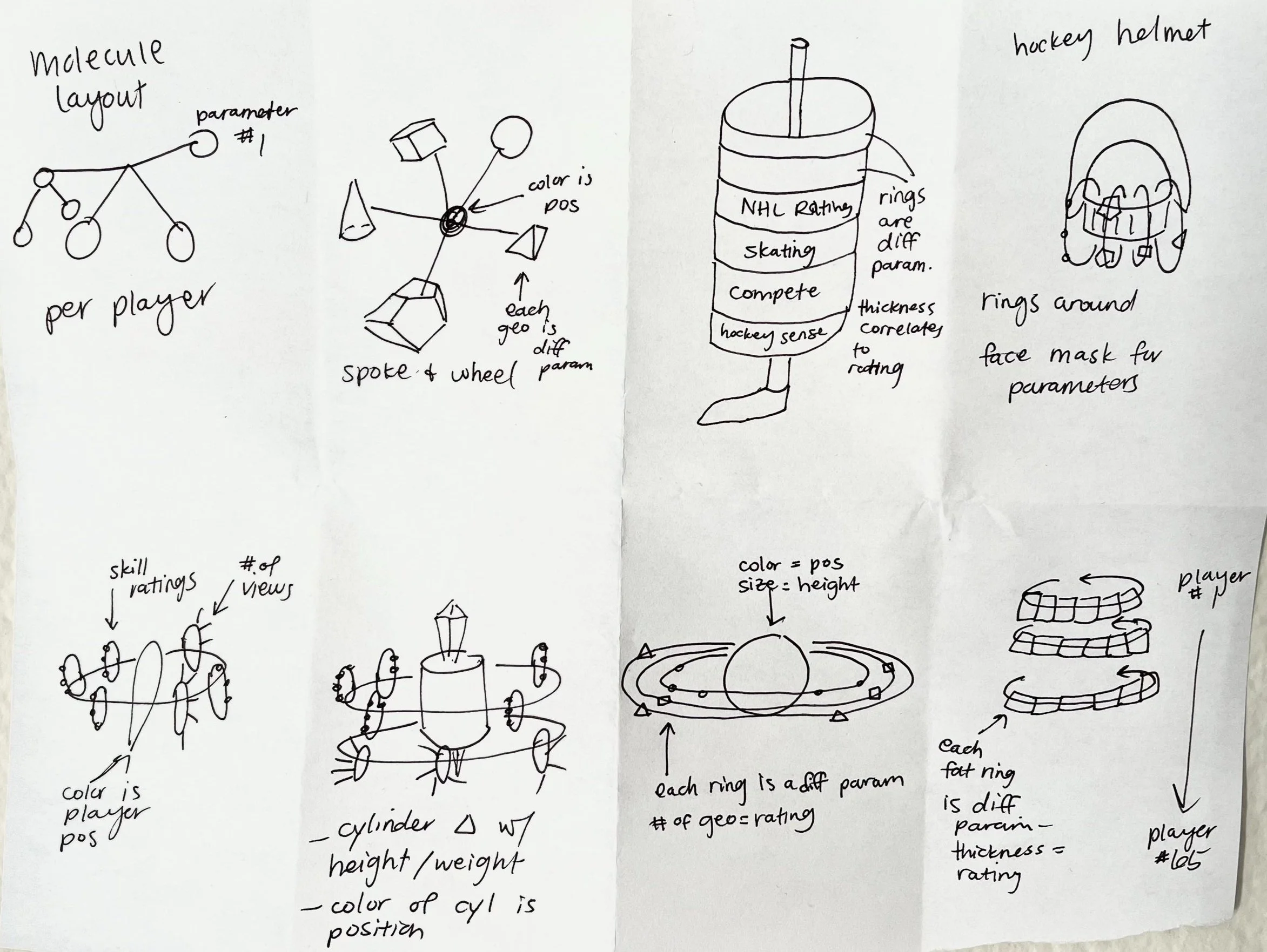
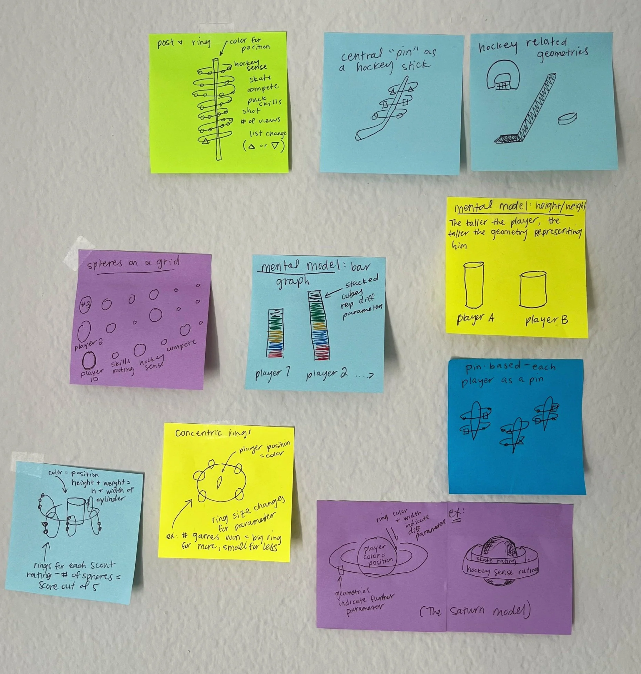
To quickly learn what geometries and 3D spatial layouts could acutely convey relationships among data points, I used paper and digital ideation techniques, testing internally and with users. These collections of geometries turned into player glyphs, our visual representation of an individual hockey player’s data.
Integrating Critical Feedback:
I’m a believer in testing with users early and often. While testing early digital designs of our player glyph, I found that key stakeholders—including the team’s head coach—were overwhelmed by the amount of data integrated in the player glyph. As a result, I iterated to fewer, contextually based parameters with similar geometric shapes to rely on foundational mental models.
A prototype I created of the flyover interaction, allowing the user to explore a visualization of MLB player glyphs.

before - too many parameters that users struggled to keep track of

after - overnight prototyping during an onsite led to fewer parameters and simplified geometries.
Innovative Interaction Design:
I designed novel interaction patterns using 3D spatial and gesture-based interfaces, including a "flyover" feature that enabled users to gesture on their trackpad to "fly" through 3D data representations, like an airplane navigating clouds. This feature gave users the ability to analyze their data from different perspectives, enabling seamless exploration of complex datasets that fostered deeper engagement.
Prioritizing Scalability:
Because our visualizations rely heavily on interaction in 3D space, we wanted these designs to scale for AR and VR use. As such, I collaborated with a video game developer and designed for a Unity-based visualization engine to future-proof our design methods.

Decisions
Key Design

Celebrating Hick’s Law
User testing revealed that after a critical mass, increasing the number of parameters increased the time spent on key tasks.
This principle—how decision-making time increases with the number of choices—aligned with a core design principle I established in user research, underscoring the importance of simplicity in design.
Early player glyph prototype:
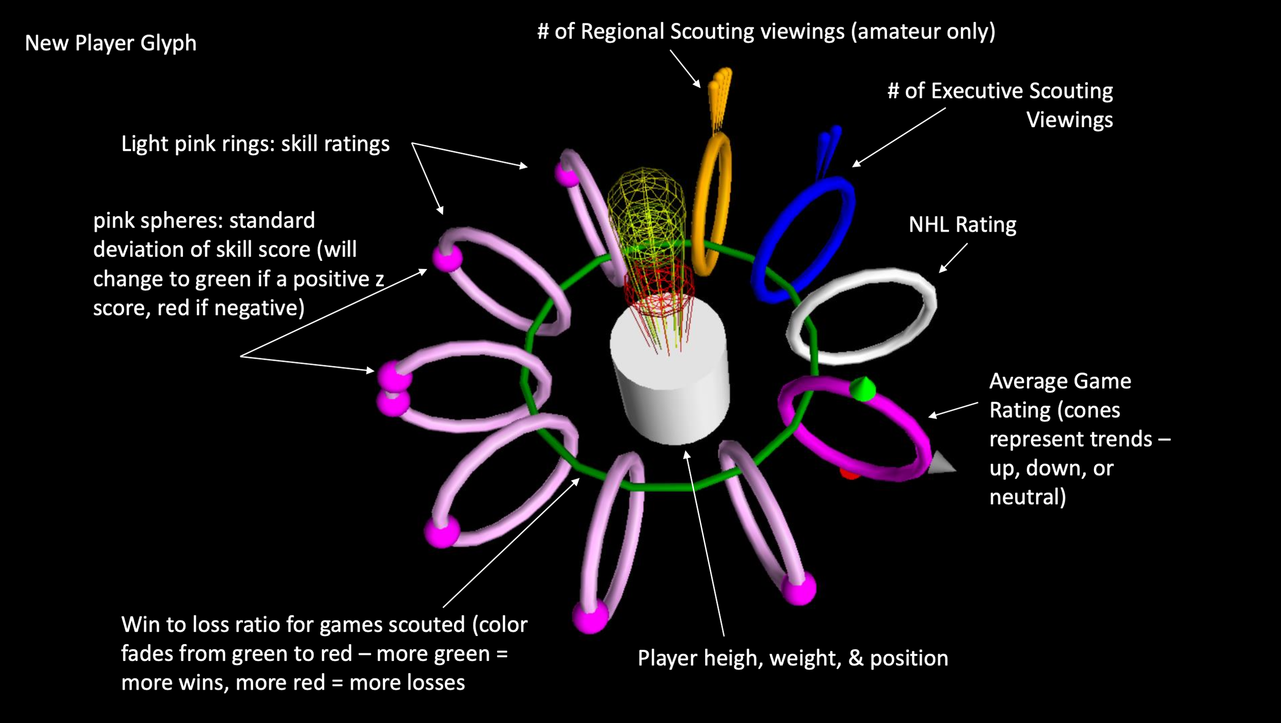
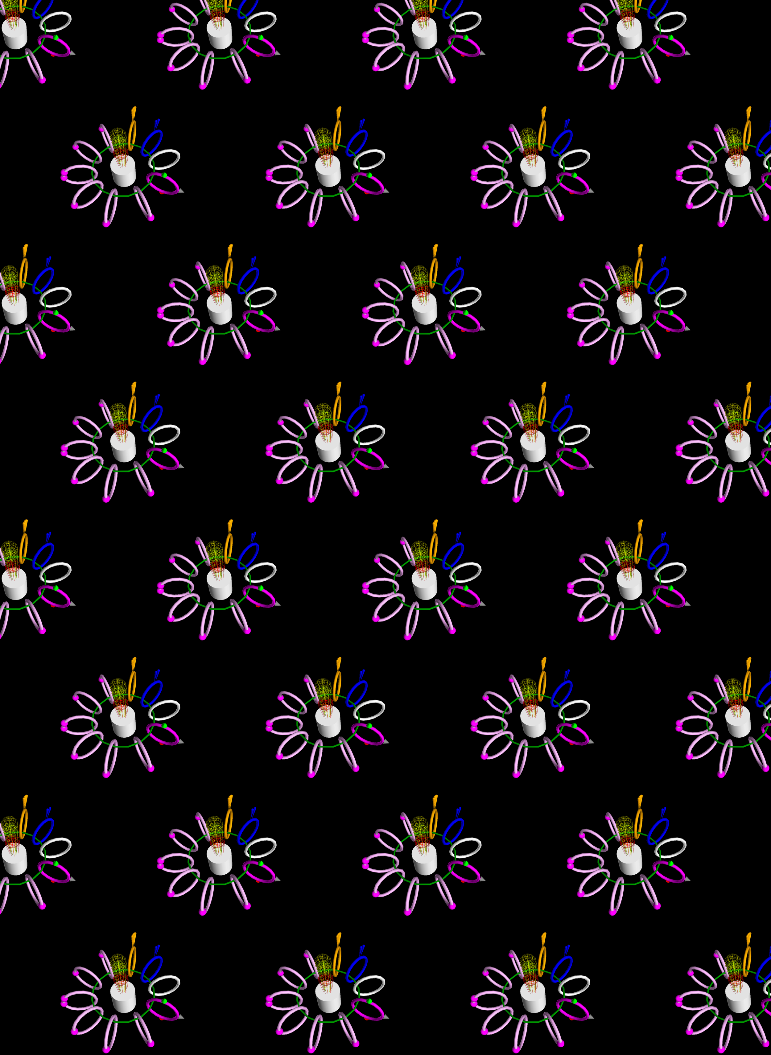
Final Player Glyph, with parameters simplified and dependent on the context of the data visualization as a whole

Shapes Matter
Users could more easily detect minute differences in data when comparing rounded shapes.
Designs relied heavily on ring-like, spherical, and cylindrical geometries.
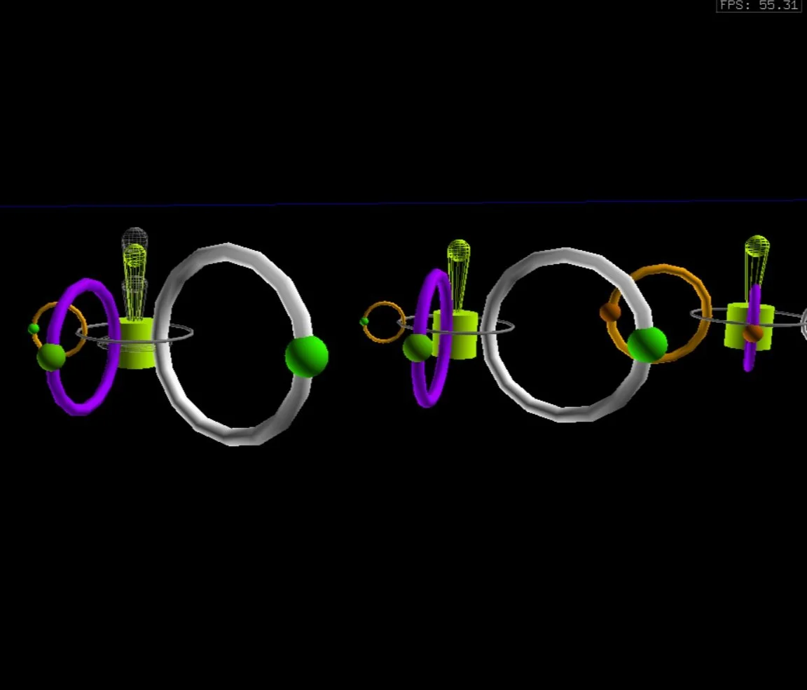
Example visualization for testing geometries with users

Leverage Mental Models

Users typically preferred layouts, colors, and shapes that correspond with mental models - e.g. red for worsening and green for improving values.
Our player glyphs and layouts incorporated generalized and team-specific mental models to speed meaning-making.
Using mental models to represent height and weight with cylindrical geometries. This became the central shape in our player glyph.
Impact
Matri’s data visualization product improved workflows and bolstered evidence-backed decision making.
12% decrease in time on task across key player acquisition processes—i.e. building draft lists, creating scouting reports.
30% increase in data-driven decision making, measured through observing draft and trade meetings.
50% increase in user satisfaction over previous software suite, as measured through usability testing and surveys.
The team achieved their key goal of reaching the NHL playoffs 1 season earlier than planned.