
meet Eleanor
Our CEO wanted to channel her inner Steve Jobs with an Apple-style user interface for our flagship product. Animated mesh gradients just entered the chat. 💬
The Product:
I designed a sleek, Apple-inspired interface for navigating cutting-edge 3D data visualizations. Think "Steve Jobs meets neuroscience brunch babes.”


Snapshot 📸:
Timeline: 6 months
Team: 2 designers, engineers, 1 data scientist, and our CEO (with plenty of visionary input)
Platform: web 🖥️ & mobile📱

Key Stats:

60% faster data navigation for users 🚀
23% increase in user retention post-launch 📈
15% boost in user satisfaction 😊
Tackling the challenge
Matri’s existing '90s-era software lacked the usability and intuitiveness expected in modern interfaces, creating a frustrating user experience. When navigating data feels more like solving a Rubik’s Cube blindfolded, engagement plummets faster than flip phone sales after the iPhone release. My mission? To craft an elegant interface leveraging modern HCI principles, making data interaction feel as smooth as your favorite playlist on shuffle.
Process Insights
Creating Eleanor meant crafting an interface where sleek aesthetics met seamless usability, prioritizing user needs at every step. Here’s how I applied user-centered design principles to achieve this:
Stakeholder Collaboration: Picture brainstorming sessions with neuroscientists and data scientists—part science fair, part design workshop. From these sessions, I mapped cognitive workflows and uncovered pain points, ensuring Eleanor pretty AND practical, balancing technical complexity with user-friendly interactions.
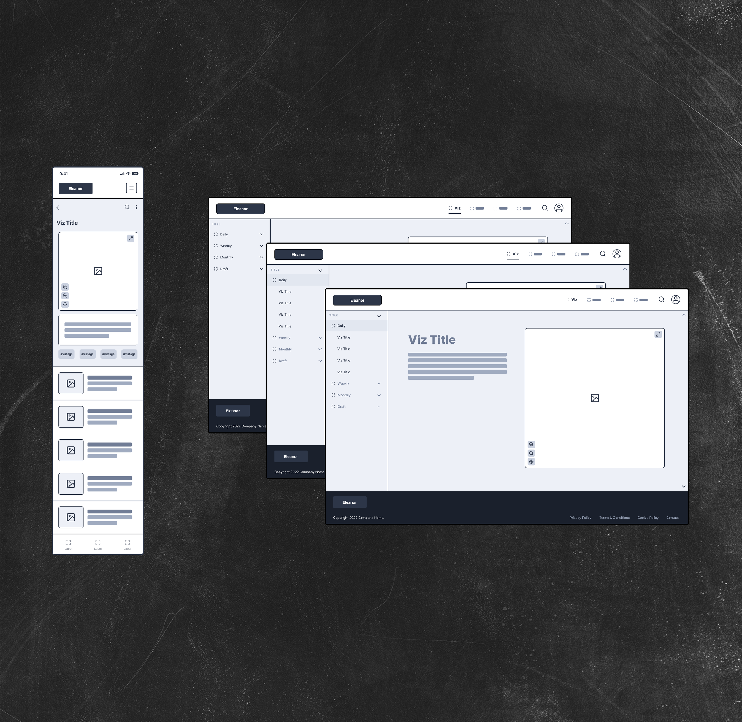
Click through my wireframe prototype of Eleanor!
Cross-Disciplinary Input: Engineers love details, so we worked hand-in-hand to transform complex 3D data visualizations into approachable visual elements. Together, we ensured Eleanor’s interface balanced technical feasibility with seamless usability.

Obligatory photo of my favorite collaborator, my dog Billie Jean, helping me storyboard.
Iterative Prototyping: Building clickable prototypes in Figma felt like crafting a digital choose-your-own-adventure book—testing, tweaking, and refining until users couldn’t help but say, “Wow.” Testing early and often helped me refine interactions and navigation pathways, creating a smoother, more intuitive user experience.

Executing our 3D data visualization viewer took some engineering prowess.
This process turned neuroscience-based data analysis feel approachable—even fun!
Key Design
Decisions


Strategic Branding:
Inspired by Matri’s ethos of empowerment, I developed a palette rooted in cognitive science, using cool tones for focus and calm, accented by playful pops of peach to draw the eye. As our main accent, Eleanor Lotus became an iconic grounding visual touchpoint.

User-Centric Navigation
I designed wireframes that felt like a treasure map to data mania, complete with intuitive pathways for exploring visualizations, tweaking profiles, and finding support without breaking a sweat. Clear wayfinding and strong information scent were the name of the game.


Inspired Typography
Montserrat brought the boldness, Fira Sans brought the finesse, and together, they channeled Apple’s clean aesthetic—perfect for our CEO’s inner Steve Jobs. 🥂

Gamified 3D Interaction
Navigating Eleanor’s 3D visualizations was designed to feel less like work and more like play. I crafted movement through 3D space to evoke the intuitive flow of a video game, making complex data exploration feel dynamic, engaging, and downright fun.
I called this our “flyover” feature because it allowed users to fly over—or through—their data.
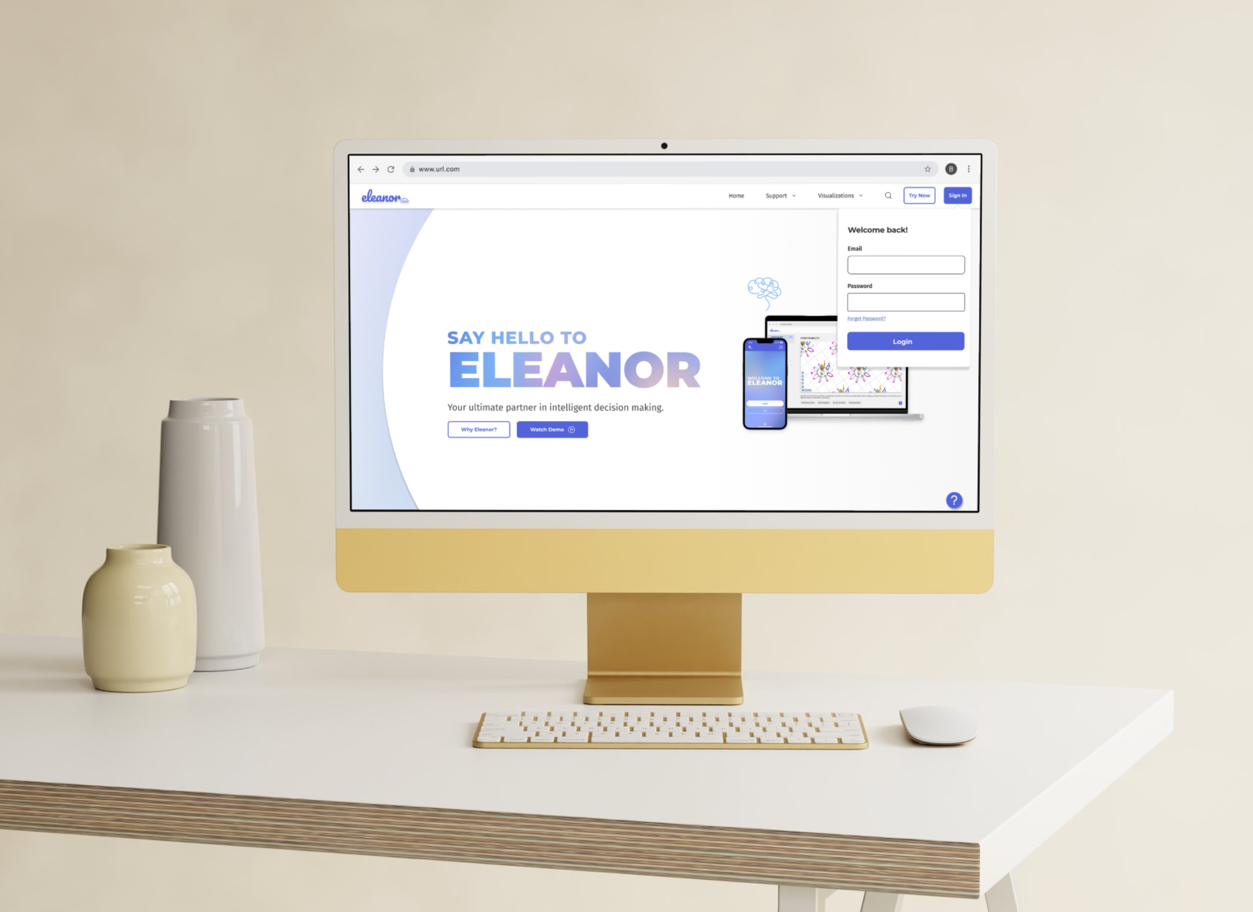
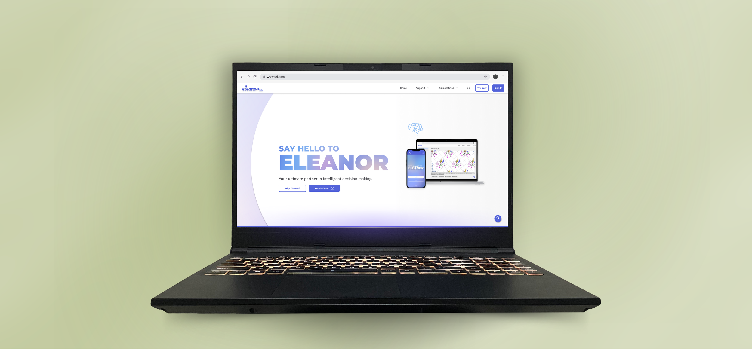
Homepage (featuring my in-text animated mesh gradient) with sign in dropdown.
Solution
Highlights
Colors & Typography: A fresh, modern palette and clean fonts that felt professional without the yawn.
Wireframes: Desktop and mobile designs that mapped out every step of a user’s journey, from “I’m lost” to “I found the data!”
Prototypes: Figma prototypes so real, users almost reached into their screens to interact with them.


Viz browser, once the user logs in.

Viz viewer expanded
An opened visualization within the Eleanor UI.
Impact
Eleanor didn’t just change how users interacted with data—it made them want to interact with it:
🚀 60% faster navigation
📈 23% increase in retention
😊 15% boost in satisfaction
Empowered decision-makers with intuitive access to once-intimidating visualizations
Mission accomplished. 🎯
Play the video to view a prototype of a typical user flow within Eleanor.
LESSONS LEARNED
Designing for 3D data is a little like juggling—except the pins are user needs, aesthetics, and technical feasibility. One standout moment? Collaborating with engineers to simplify complex features without sacrificing usability or that “wow” factor. Eleanor taught me that when creativity and collaboration collide, incredible things happen.
Explore More
🔍
Explore More 🔍

Contact me to chat about how design can even make data analysis feel approachable—or explore my next case study.